Bricks & Stickers
Featured in Pidgin Journal #20 (The Ageism Issue)
Winter 2016
Pages 80-88
“If I vibrate with vibrations other than yours, must you conclude that my flesh is insensitive?” -Claude Cahun, Héroïnes
The modern era is filled with testaments to poor aging. Eager to build in big and fast numbers, its architects were often quick to select untested material palettes. For many, what looked stunning and rigid with the scaffolding removed soon crumbled under its own weight. Quick to rise, quick to fall.
But Mies van der Rohe was famously one to be more vain than hasty. While many architects communicated their allegiances to industrial functionalism through the use of sturdy yet ultimately ruinous materials (such as poured-in-place concrete for grain elevators or self-oxidizing metal for factories), Mies preferred his buildings clad in anything that would allow them to last eternal. Here his trademark use of stainless steel and marble ring clear, though the heavy use of exposed brick in his early career seems at first glance to be contradictory with this ambition.
The Haus Lange, built in Krefeld, Germany in 1928 is a telling example. Unlike the hopeful purity of the usual modernist materials, the bricks of the Haus Lange were selected and stacked in a decidedly imprecise manner; a little chipped, and a little uneven. This was Mies’ method of ‘pre-aging’ the building, ensuring that the house would mature as contently as any other brick building before it. Peter Blake’s vilification of modernist materials adequately sums up Mies’ sentiments at the time: “Exposed, flat, poured-in place concrete surfaces will frequently stain and develop shrinkage cracks and are sure to look prison-grim under overcast skies, whereas brick and stone can look quite beautiful in a rainstorm.”
The decision might seem at odds with the times, perhaps not forward-thinking enough for the shrewd observer. As Philip Johnson and Henry-Russell Hitchcock point out in The International Style, "the use of [exposed] brick tends to give a picturesqueness which is at variance with the fundamental character of the modern style." But Mies was also more vain than adherent.
Despite the consequences, the one material he couldn’t avoid using - the one that ages just as poorly as concrete and exposed metal combined; the one that fogs up, streaks, scratches and warps - was glass. As dedicated as Mies was to conceit, he also couldn’t deny his clients natural light, and that meant lots of windows in places hard to reach. When the Haus Lange aged, the bricks stayed perfectly imperfect while the glass just became imperfect.
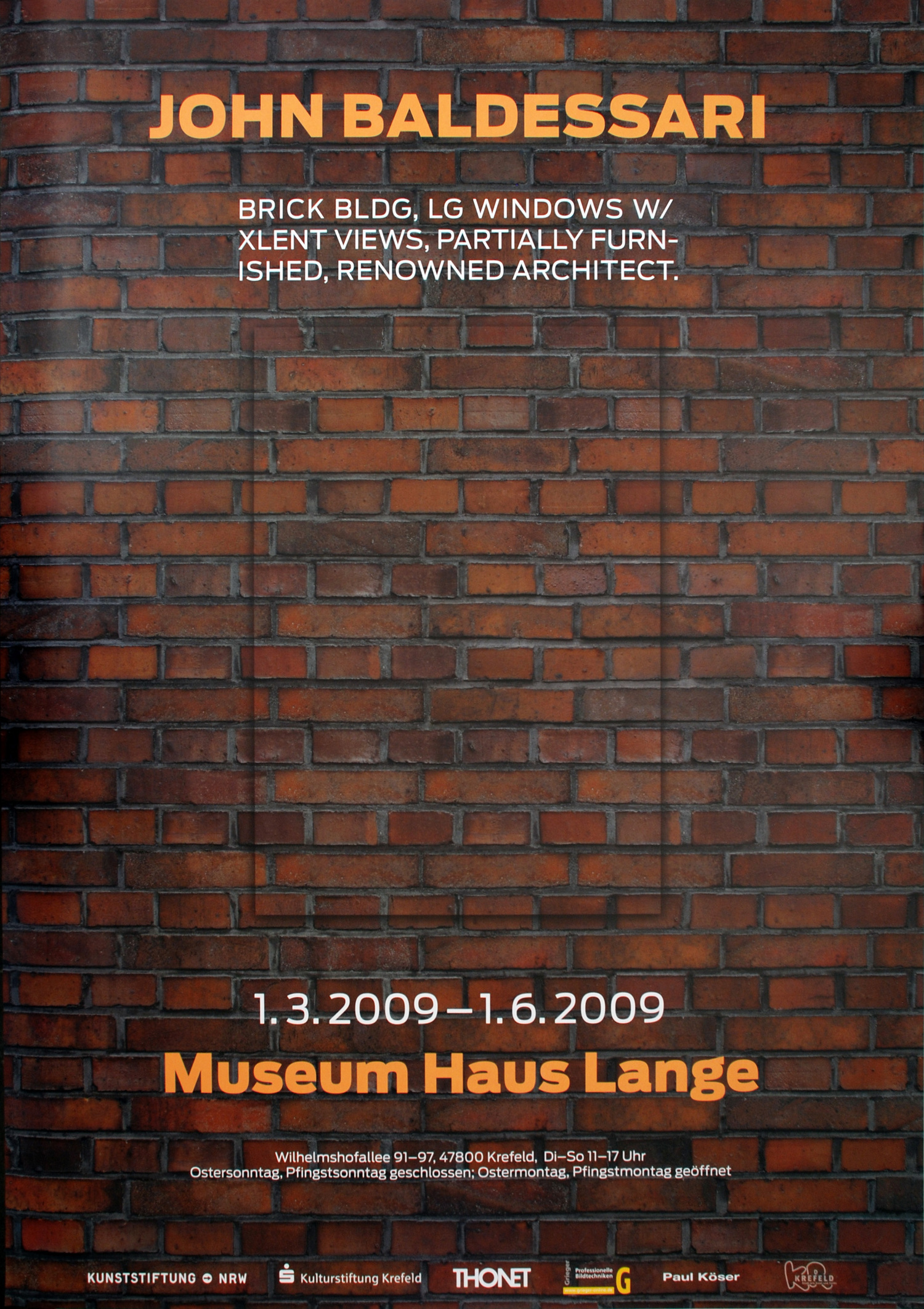
The house’s presence as a questionably aged object was challenged when it was converted into a contemporary art museum several decades later. In 2009, artist John Baldessari was given the keys to the conflicted building and potentially found a solution to Mies’ fear of aging.
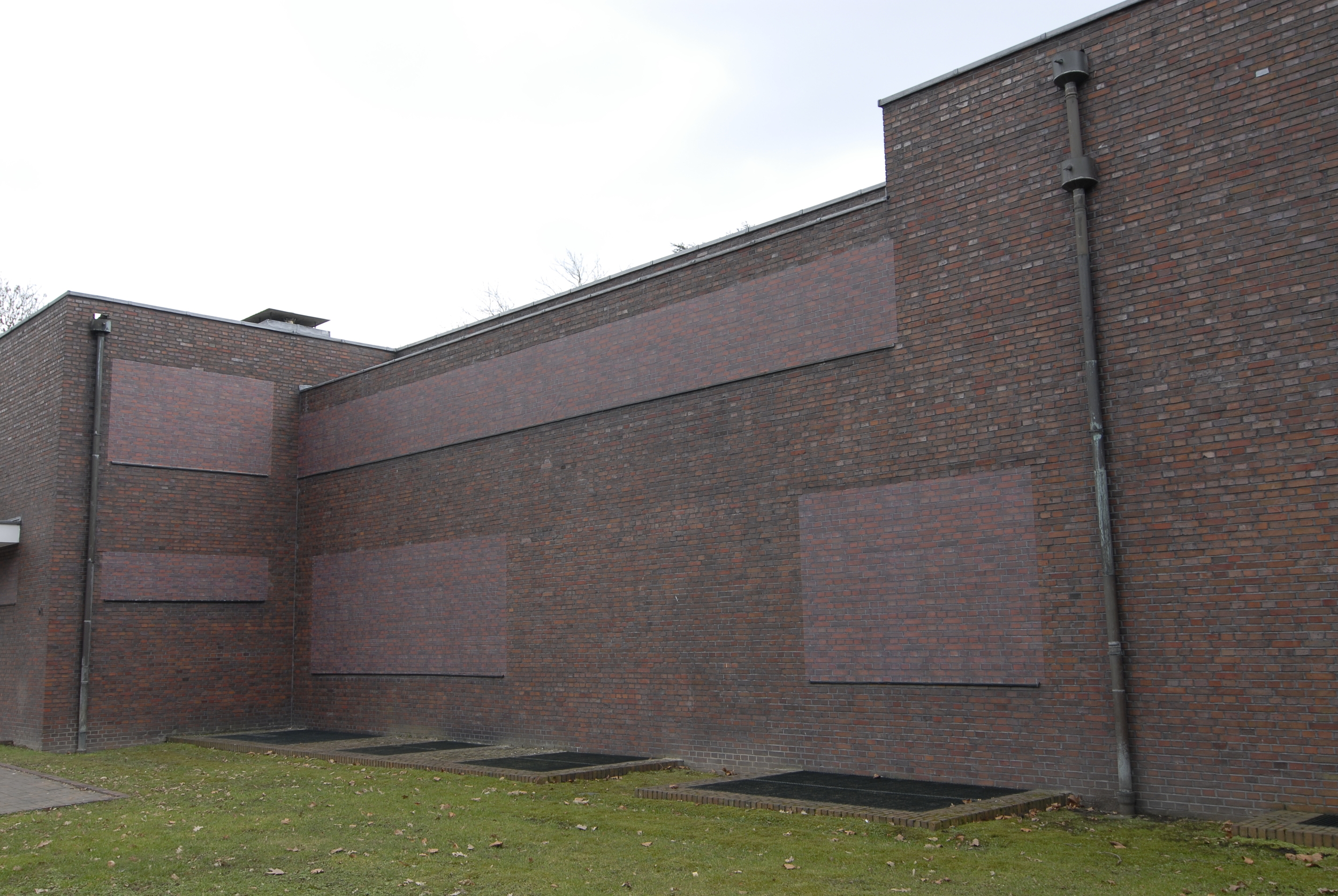
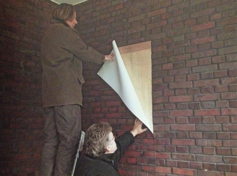
For his installation, Baldessari covered the exterior windows with brick pattern peel & stick contact paper to match Mies’ original cladding. The visages effectively transformed the home into one large envelope of indecipherably various materials, one thick and the other flat. And because the photos on the contact paper were elevations of the then 81 year old Haus Lange brick pattern, they were, by transitive property, just as perfectly imperfect as the bricks they emulated. On overcast days, they shared the very same reddish hue.
The illusions continued past the entrance. Every window was covered from the inside with a still image of a Southern Californian nature scene. Some displayed a forest while others an ocean at perpetual high tide. The gallery lighting bore no shadows and the stickers no sunlight, rendering the interior as far removed from time’s grasp as a vacuum of space. In execution, Baldessari not only slowed down the aging process of the Haus Lange; he nearly brought it to a standstill.
If considered a permanent fixture, could Baldessari’s paper-thin apparitions save face? Though the man who coined “God is in the details” himself might not have preferred it, contact paper does align with a certain materialist evolution. What bricks represented for several centuries in the building industry - a durable and economical means of surfacing - is essentially what peel & stick contact paper represents for the greater part of this century (with the exception, of course, that it does not insulate, but rather signifies insulation). It is one of this century’s cure-all products for its ability to mimic anything in any state of decay, allowing it to appear as nostalgically ruinous or timelessly pristine as one desires. The building industry has appropriated contact paper like a blank canvas or a Photoshop stamp, with homeowners not far behind. In the case of the Haus Lange, it was able to hyperbolize a specifically modern ruggedness.
To go further, as museum director Martin Hentschel observes of the installation, "the block bonded brickwork gives the impression of solid masonry, [although] it is in fact superimposed; the walls have only a rudimentary function as supports. In other words: the brickwork is largely ornamental, placing it into the same category as wallpaper!" Though he claimed to be performing as the 'contra-Mies,' Baldessari's real task was to carry Mies' lust for masks into the next century. Conveniently enough, contact paper's inability to self support means that its only available function is always as the mask for something else.
Fakery often follows closely behind vanity. A wealth of research goes into finding material alternatives to tedious and expensive things (even when those methods weren’t especially tedious or expensive to begin with), and there is no question that the progression from bricks and nature scenes to stickers reflects a profit-driven venture bigger than Mies and Baldessari. This situation is promoted by a market with bigger and faster numbers than the modernists could ever have conceived. For those that benefit from the many uses of contact paper, integrity is overrated when it can be replaced with its stunt double. To ditch the trowel for a staple gun expedites the building process (both in its erection and demolition) while transparently communicating that same motive for ease and convenience; it is within this cultural standard that Baldessari applied stickers to windows.
Over time, the two bricks would reveal their differences more apparently: Mies' destined to sprout a little mossy green around the edges, while Baldessari's likely to fade a little in the sunlight. However, with the proper adhesive and some light maintenance, the two could look quite beautiful in a rainstorm.


